Visual designer shaping identities through motion and visual language
Zumiño
,
Identity
,
Archive
These are natural juices, mainly apple based. The concept is about reflecting the imperfection of untreated fruit, free of sulfates, where the importance of the natural and organic is always at the forefront, from packaging design to typography, illustration, and final art direction.

Zumiño_01

Zumiño_02

Zumiño_03

Zumiño_04

Zumiño_05

Zumiño_06

Zumiño_07

Zumiño_08
Zumiño_09

Zumiño_010
Zumiño
,
Identity
,
Archive
These are natural juices, mainly apple based. The concept is about reflecting the imperfection of untreated fruit, free of sulfates, where the importance of the natural and organic is always at the forefront, from packaging design to typography, illustration, and final art direction.
Zumiño_01
Zumiño_02
Zumiño_03
Zumiño_04
Zumiño_05
Zumiño_06
Zumiño_07
Zumiño_08
Zumiño_09
Zumiño_010
Kálm
,
Packaging
,
Archive
kálm is a relaxing CBD brand designed to promote tranquility and well-being. Its visual identity features soft, warm ochre tones and pastel colors, creating a peaceful and welcoming aesthetic. The packaging reflects simplicity and elegance, offering a sense of calm even before the product is opened. This design approach embodies the brand’s focus on wellness, delivering natural relief and serenity. With its gentle color palette and minimalist style, Kalm resonates with those seeking a mindful, balanced lifestyle offering a moment of peace in the middle of a busy day.

Kälm_01

Kälm_02

Kälm_03

Kälm_04

Kälm_06

Kälm_07
Kálm
,
Packaging
,
Archive
kálm is a relaxing CBD brand designed to promote tranquility and well-being. Its visual identity features soft, warm ochre tones and pastel colors, creating a peaceful and welcoming aesthetic. The packaging reflects simplicity and elegance, offering a sense of calm even before the product is opened. This design approach embodies the brand’s focus on wellness, delivering natural relief and serenity. With its gentle color palette and minimalist style, Kalm resonates with those seeking a mindful, balanced lifestyle offering a moment of peace in the middle of a busy day.
Kälm_01
Kälm_02
Kälm_03
Kälm_04
Kälm_06
Kälm_07
Eternity EP
,
Identity
,
Archive
Design and artwork for CMR 007 Man/ipulate (@man__ipulate) – Eternity EP (incl. Alex Kassian Remix @alex__kassian). The project brings together three key elements: typography, stickers, and color treatment: Typography – Bold, custom-modified typefaces recreate the distinctive strokes of 1990s flyers, evoking the rave spirit and the symbolic universe of Berlin’s Love Parade, the iconic festival that originated in 1989. Stickers – A visual resource that reinforces 1990s iconography and electronic culture. At the same time, it nods to the track “Sunshine”, the quintessential anthem of the Love Parade. Color treatment – A chromatic approach that situates the record within the world of fanzines and the flyer aesthetics of electronic and festival culture of that era.

Eternity EP_01

Eternity EP_02

Eternity EP_03

Eternity EP_04

Eternity EP_05

Eternity EP_06

Eternity EP_07
Eternity EP
,
Identity
,
Archive
Design and artwork for CMR 007 Man/ipulate (@man__ipulate) – Eternity EP (incl. Alex Kassian Remix @alex__kassian). The project brings together three key elements: typography, stickers, and color treatment: Typography – Bold, custom-modified typefaces recreate the distinctive strokes of 1990s flyers, evoking the rave spirit and the symbolic universe of Berlin’s Love Parade, the iconic festival that originated in 1989. Stickers – A visual resource that reinforces 1990s iconography and electronic culture. At the same time, it nods to the track “Sunshine”, the quintessential anthem of the Love Parade. Color treatment – A chromatic approach that situates the record within the world of fanzines and the flyer aesthetics of electronic and festival culture of that era.
Eternity EP_01
Eternity EP_02
Eternity EP_03
Eternity EP_04
Eternity EP_05
Eternity EP_06
Eternity EP_07
Tauro E.P.
,
Identity
,
Archive
Tauro is a complete sensory experience in both composition and instrumentation. This project, the result of years of work, reflects the artist’s maturation and growth process, utilizing unfinished previous works. The idea was to represent the artist's personal process, the effort, and how, thanks to the process of each of the previous albums, he has created "Un Nuevo Ayer". To achieve this, we trained the artificial intelligence with the covers of the previous albums, generating new graphics that pave the way for a new one.

Tauro_01

Tauro_02
Tauro_03

Tauro_04
Tauro E.P.
,
Identity
,
Archive
Tauro is a complete sensory experience in both composition and instrumentation. This project, the result of years of work, reflects the artist’s maturation and growth process, utilizing unfinished previous works. The idea was to represent the artist's personal process, the effort, and how, thanks to the process of each of the previous albums, he has created "Un Nuevo Ayer". To achieve this, we trained the artificial intelligence with the covers of the previous albums, generating new graphics that pave the way for a new one.
Tauro_01
Tauro_02
Tauro_03
Tauro_04
Pinhata
,
Graphics
,
Archive
Visual identity that captures the playful spirit behind their handmade necklaces. From the bold logo to the vibrant palette, every element was designed to celebrate individuality and joy, just like each piece they create.

Pinhata_01

Pinhata_02

Pinhata_03

Pinhata_04

Pinhata_05

Pinhata_06
Pinhata
,
Graphics
,
Archive
Visual identity that captures the playful spirit behind their handmade necklaces. From the bold logo to the vibrant palette, every element was designed to celebrate individuality and joy, just like each piece they create.
Pinhata_01
Pinhata_02
Pinhata_03
Pinhata_04
Pinhata_05
Pinhata_06
HT FONT
,
Tipography
,
Archive
HT Font is a heavy geometric typeface with a strong presence. Clean shapes, balanced proportions,

HT_Font_01

HT_Font_2

HT_Font_03

HT_Font_04

HT_Font_05

HT_Font_06
HT FONT
,
Tipography
,
Archive
HT Font is a heavy geometric typeface with a strong presence. Clean shapes, balanced proportions,
HT_Font_01
HT_Font_2
HT_Font_03
HT_Font_04
HT_Font_05
HT_Font_06
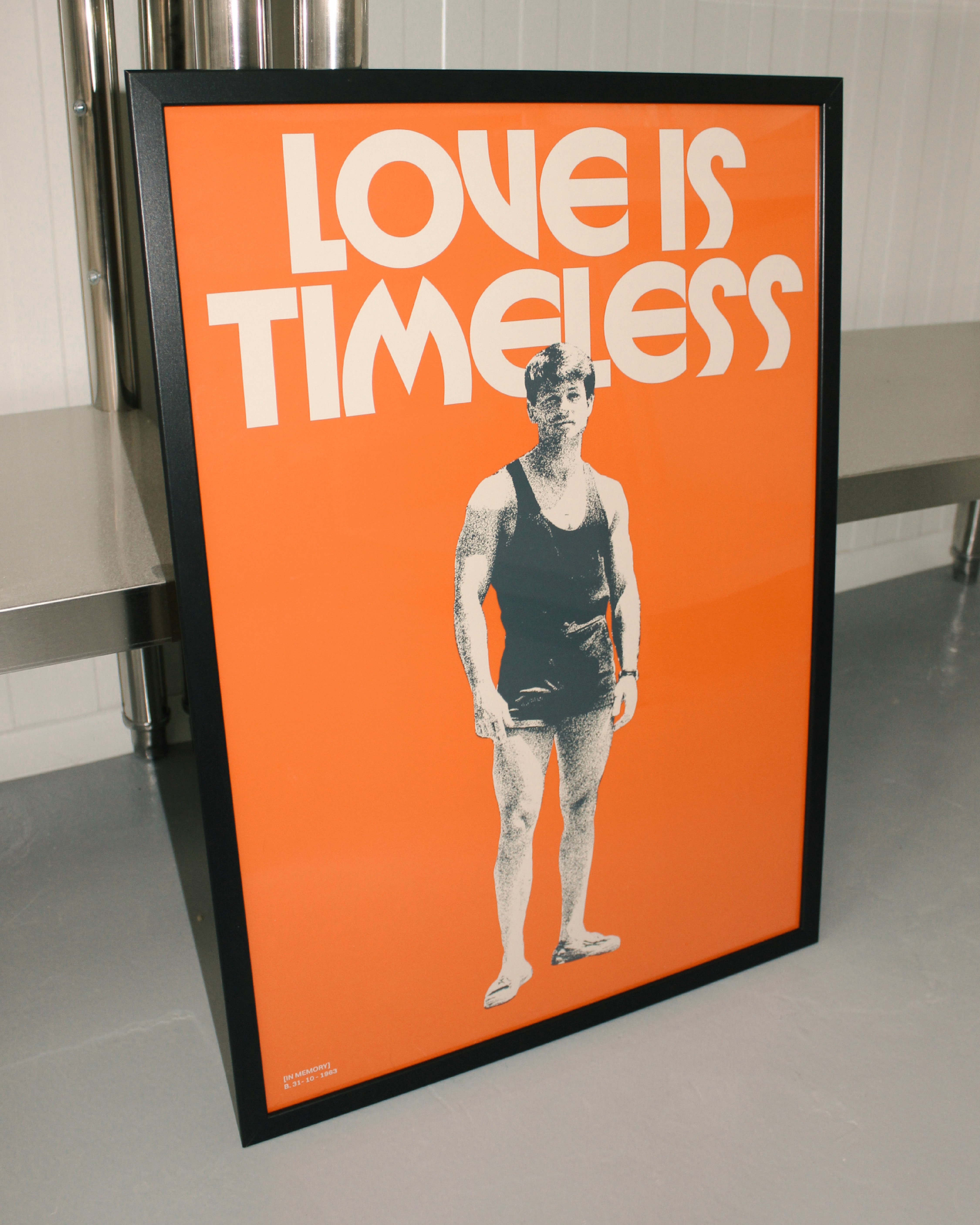
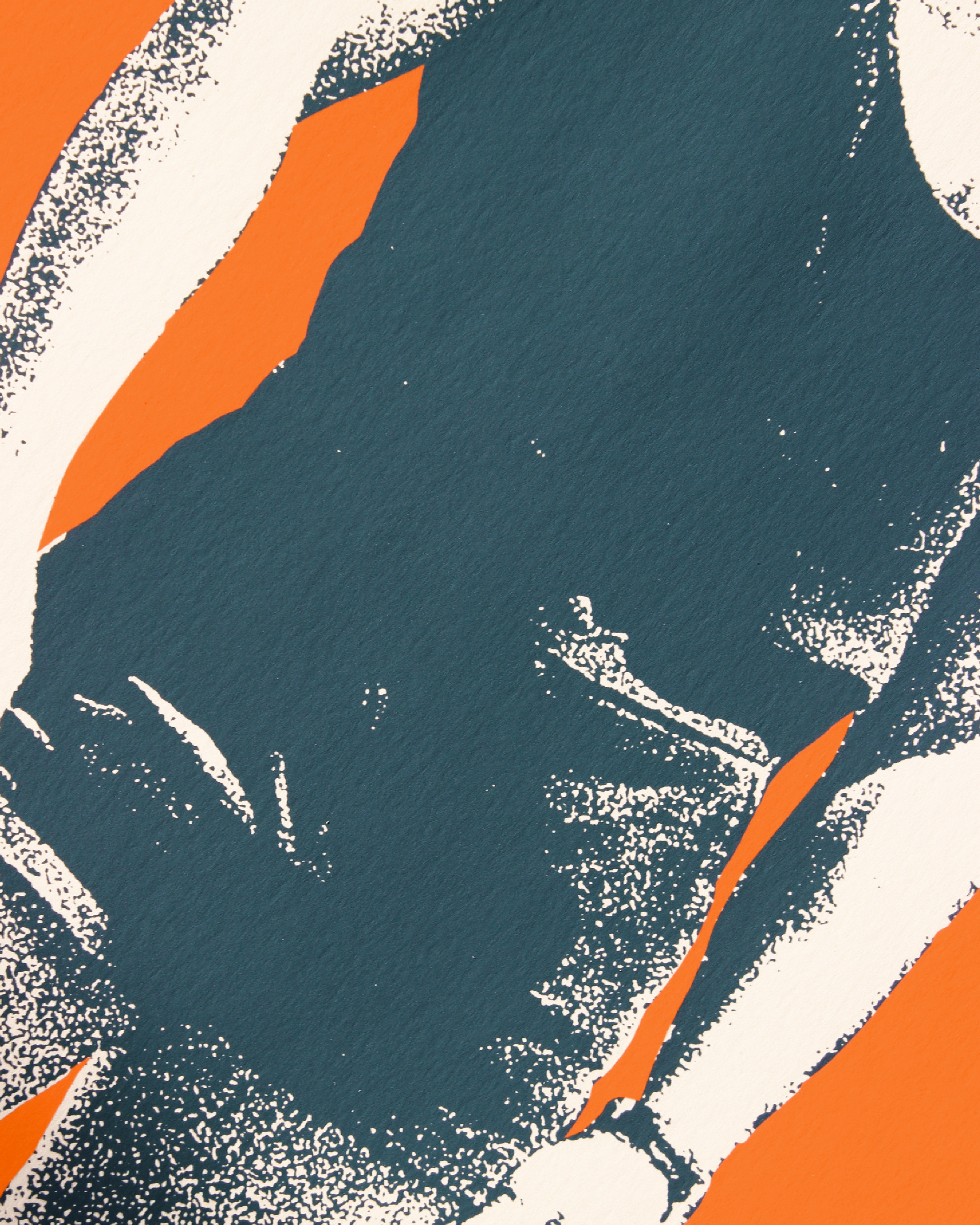
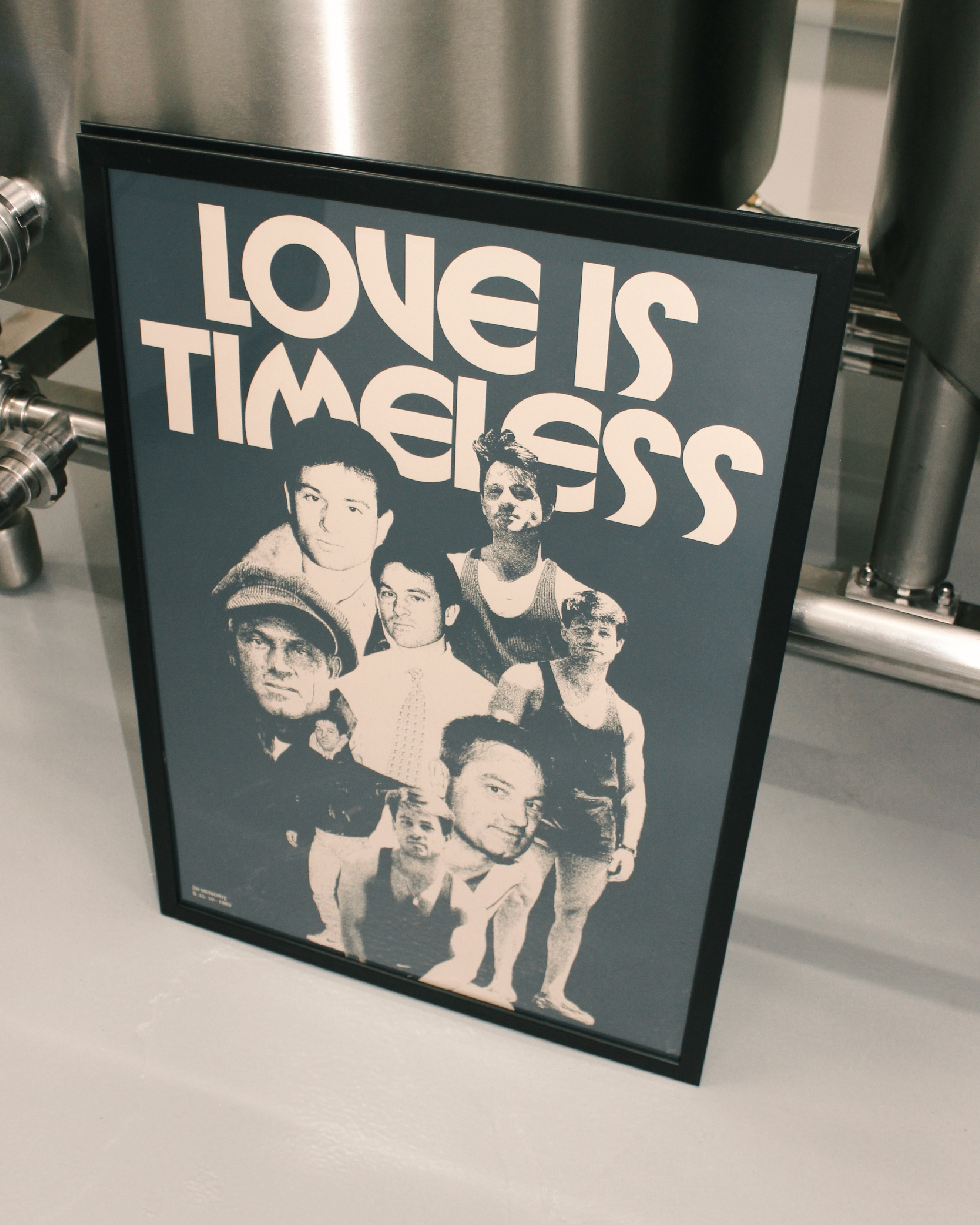
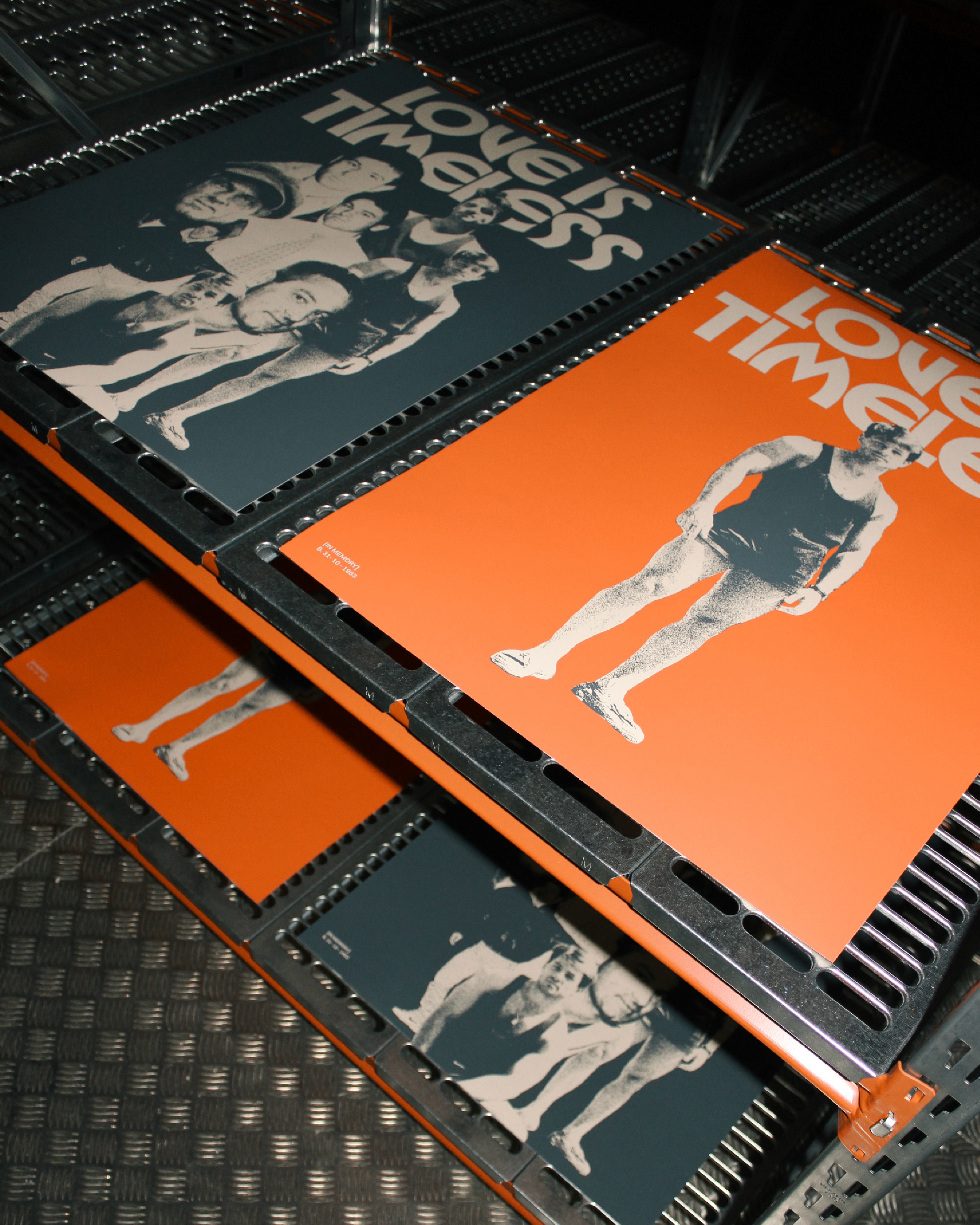
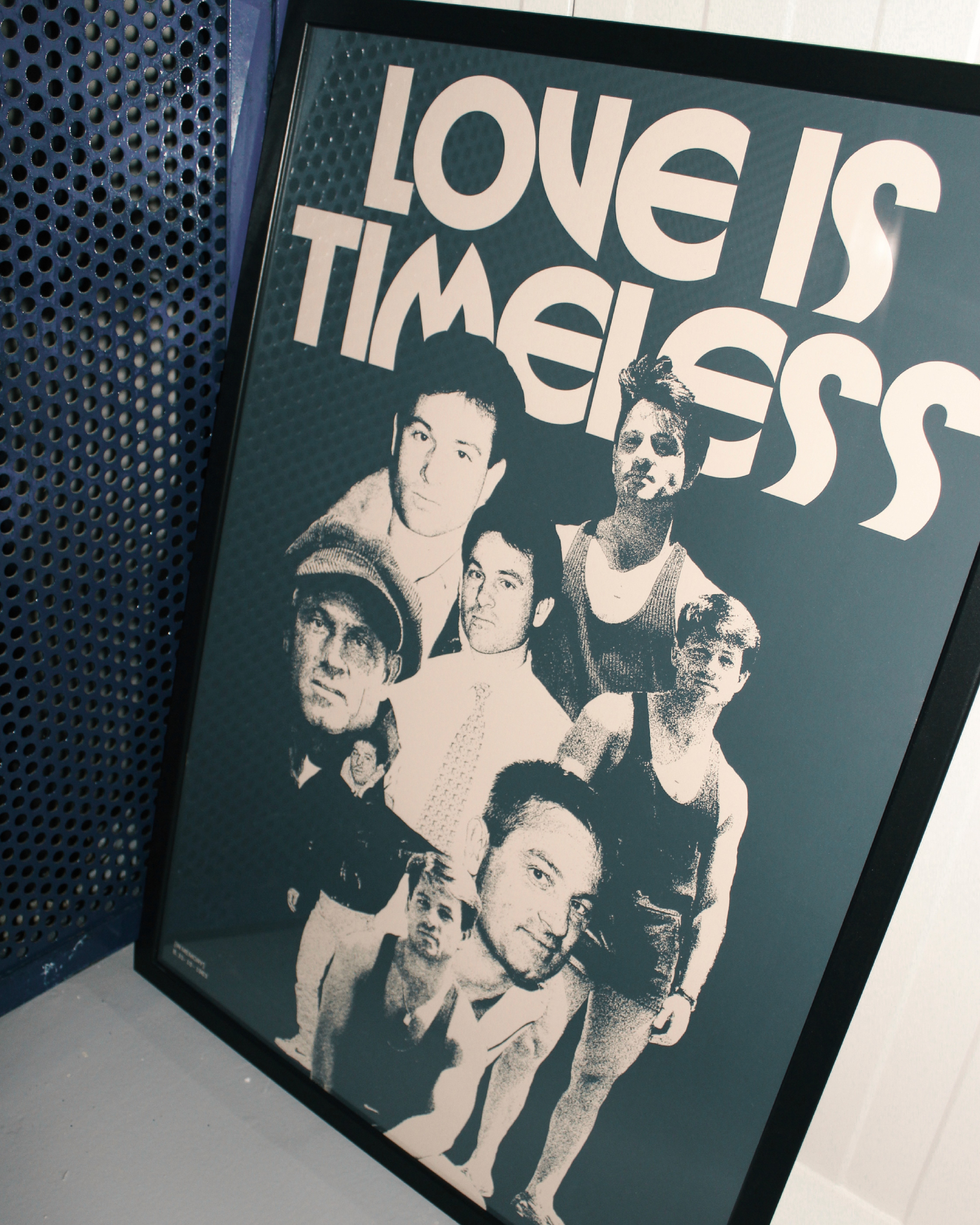
Love is timeless
,
Poster
,
Archive
My father passed away on 17 February, and I created these posters as a way to honour him. I designed them to gift to my family on what would have been his birthday, something meaningful that we could all keep close. I hope you like it.
Love is timeless
,
Poster
,
Archive
My father passed away on 17 February, and I created these posters as a way to honour him. I designed them to gift to my family on what would have been his birthday, something meaningful that we could all keep close. I hope you like it.
Turbo release
,
Poster
,
Archive
Design and lettering for the launch of the Turbo creative collective. This poster features a unique photo of my mother sitting in a car, capturing a moment full of nostalgia and personality. The hand-drawn let- tering complements the image, adding a warm and authentic touch that enhances the essence of the memory. The combination of the photograph and the handcrafted design creates an emotionally powerful piece, conveying a sense of closeness and sentimentality. It’s a work that celebrates both the moment frozen in the image and the art of lettering, creating a deep connection with anyone who sees it.

Turbo_01

Turbo_02

Turbo_03

Turbo_04

Turbo_05

Turbo_06
Turbo release
,
Poster
,
Archive
Design and lettering for the launch of the Turbo creative collective. This poster features a unique photo of my mother sitting in a car, capturing a moment full of nostalgia and personality. The hand-drawn let- tering complements the image, adding a warm and authentic touch that enhances the essence of the memory. The combination of the photograph and the handcrafted design creates an emotionally powerful piece, conveying a sense of closeness and sentimentality. It’s a work that celebrates both the moment frozen in the image and the art of lettering, creating a deep connection with anyone who sees it.
Turbo_01
Turbo_02
Turbo_03
Turbo_04
Turbo_05
Turbo_06
San Miguel Magna
,
Art direction
,
Archive
These photos capture the vibrant and refreshing essence of San Miguel Especial and Magna, designed for a young and energetic audience. With dynamic shots showcasing the beer in lively social settings, the visuals convey a sense of fun, friendship, and adventure. The rich golden tones of the beer beautifully contrast with urban, modern backdrops, making it the perfect drink for thosewho want to enjoy life’s moments with a touch of flavor and style. The images speak to a young, spontaneous crowd, positioning San Miguel Especial as the ideal companion for unforgettable experiences.

SM_01

SM_02

SM_03

SM_04

SM_05

SM_06

SM_07

SM_08

SM_09
San Miguel Magna
,
Art direction
,
Archive
These photos capture the vibrant and refreshing essence of San Miguel Especial and Magna, designed for a young and energetic audience. With dynamic shots showcasing the beer in lively social settings, the visuals convey a sense of fun, friendship, and adventure. The rich golden tones of the beer beautifully contrast with urban, modern backdrops, making it the perfect drink for thosewho want to enjoy life’s moments with a touch of flavor and style. The images speak to a young, spontaneous crowd, positioning San Miguel Especial as the ideal companion for unforgettable experiences.
SM_01
SM_02
SM_03
SM_04
SM_05
SM_06
SM_07
SM_08
SM_09
Healed
,
Graphics
,
Archive
Some graphics for Healed, a video from @playgroundgoodies Directed by @jonigalman

Healed_01

Healed_02

Healed_03

Healed_04
Healed
,
Graphics
,
Archive
Some graphics for Healed, a video from @playgroundgoodies Directed by @jonigalman
Healed_01
Healed_02
Healed_03
Healed_04
Galgos Cataluña
,
Identity
,
Archive
Some visuals and motion for the incredible work done by Galgos Catalunya. A non-profit organization dedicated to helping galgos and podencos through foster care and adoption. With a whole lot of heart, they change lives every single day. If you can, get involved: foster, sponsor, or donate. Every gesture matters. galgoscatalunya.es

GALGO_01

GALGO_02

GALGO_03
Galgos Cataluña
,
Identity
,
Archive
Some visuals and motion for the incredible work done by Galgos Catalunya. A non-profit organization dedicated to helping galgos and podencos through foster care and adoption. With a whole lot of heart, they change lives every single day. If you can, get involved: foster, sponsor, or donate. Every gesture matters. galgoscatalunya.es
GALGO_01
GALGO_02
GALGO_03
Monogram
,
Graphics
,
Archive
Combines custom typography with graphic elements inspired by natural morphologies. Curved lines and balanced proportions were used to create a design that adapts seamlessly to different formats and scales. The organic forms bring warmth and movement, enhancing the brand’s visual personality without compromising legibility or impact.

Monogram 01

Monogram 02

Monogram 03

Monogram 04

Monogram 05

Monogram 06
Monogram 07
Monogram
,
Graphics
,
Archive
Combines custom typography with graphic elements inspired by natural morphologies. Curved lines and balanced proportions were used to create a design that adapts seamlessly to different formats and scales. The organic forms bring warmth and movement, enhancing the brand’s visual personality without compromising legibility or impact.
Monogram 01
Monogram 02
Monogram 03
Monogram 04
Monogram 05
Monogram 06
Monogram 07
Otua
,
Identity
,
Archive
Otua is a graphic identity promoting recycling in Donostia. With a modern and minimalist design, its features a stylized recycling symbol in greens, representing sustainability and organic. Otua aims to raise awareness and encourage eco-friendly habits across the community. Through simple, impactful visuals, it educates residents on the importance of recycling and reducing waste, making the message accessible to all ages.

Otua_01

Otua_02

Otua_03

Otua_04

Otua_05

Otua_06

Otua_07
Otua
,
Identity
,
Archive
Otua is a graphic identity promoting recycling in Donostia. With a modern and minimalist design, its features a stylized recycling symbol in greens, representing sustainability and organic. Otua aims to raise awareness and encourage eco-friendly habits across the community. Through simple, impactful visuals, it educates residents on the importance of recycling and reducing waste, making the message accessible to all ages.
Otua_01
Otua_02
Otua_03
Otua_04
Otua_05
Otua_06
Otua_07